Digital Content & Brand Strategy
Since 1987, ESC, has continuously expanded into new markets. As a result of these changes, their current branding needs revision to sustain growth. In collaboration, we explored what ESC represents in the community now and in the future.
Client
ESC Limited
Duration
June 2020 - January 2023
January 2023 - January 2024, Re-brand Project
Deliverables
Brand Guidelines, Content Strategy, Logo Design
How Might We?
Create a cohesive customer experience that promotes mastery, courageousness, and connection through a brand identity that celebrates ESC's history and future.
Skills
Logo Development // Brand Positioning // Web Design // Prototyping // Primary & Secondary Research // Synthesis & Ideation // Strategic Recommendations
Tools
Adobe Illustrator // Shopify // Brand Archetypes // Competitive Landscape Analysis // Brand Auditing // User Insights
What were people saying?
““I’ve been coming to ESC for years,
to me it’s all ESC”
Insight: Most customers refer to all departments under ESC Limited as “ESC” rather than “ESC Limited”, “Escape” and “Escpresso”.
Out of 23 respondents, 22 people referred to the company as “ESC”, 1 person referred to the company as “Escape”.
“I love coming in [to ESC], there is always a friendly vibe, and I usually find something I wasn’t even looking for”
Insight: Many customers have formed relationships with the team members at ESC.
50% of respondents selected an older
iteration logo when asked “what logo
do you associate ESC with most?”
Insight: ESC’s brand identity is unclear as it currently stands. One of the original logo’s still remains as the most iconic logo, which begs the question — can we go back to our roots?
Context
With ESC catering to primarily two customer segments: electricians by trade and home decorators, the biggest challenge is marrying the two opposites into one succinct brand and logo design that captures the nuances of each without creating brand identity confusion.
Most recently, ESC acquired a custom framing company, Frameworks, which required a physical renovation to accommodate the extra equipment, staff, and stock.
This created the perfect opportunity to reevaluate who ESC as a brand is.
Previous Logos, used simultaneously
ESC Limited (electrical) // Escape Home (home decor and lighting) // Escpresso Cafe (in-store cafe)
The push for a rebrand was additionally considered when identifying brand confusion in a qualitative survey.

Rebranding brought to life

ESC Apparel, Black T-shirt

ESC Apparel, White T-shirt

ESC Apparel, Black Polo

ESC Apparel, White Button Down

Directional Signage

Directional Signage

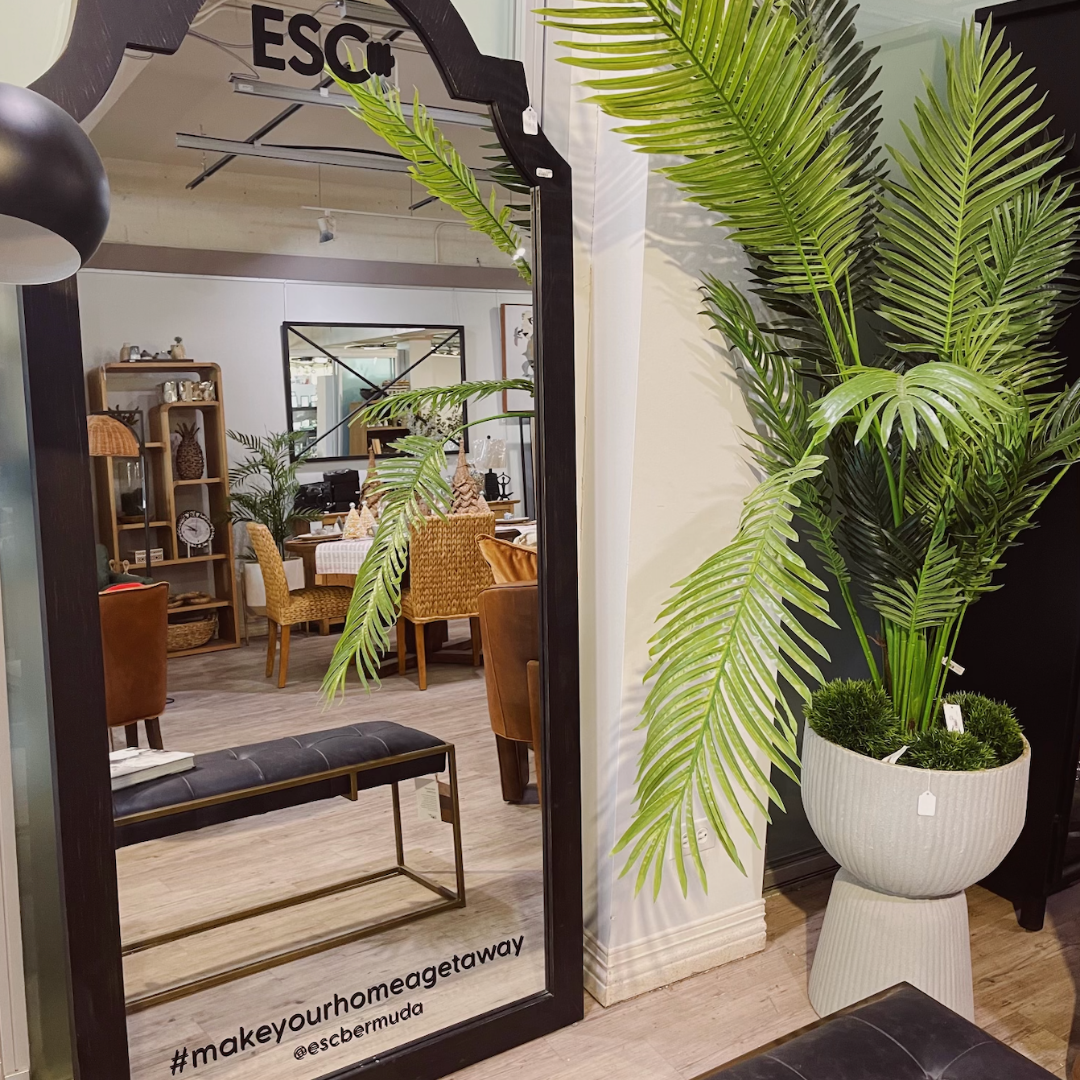
Signage

Informational Signage

Informational Signage

Marketing Material
Marketing Material

Marketing Material

Marketing Material

Informational Signage, Opening Hours

Signage

Signage Installation

Reflection of Signage inside

Installation

Installation

Installation

Installation

ESC & Frameworks Merger: A timeline dedicated to the history of Frameworks and it's future at ESC